Horizontally scroll a table in HTML
After I published my post about manipulating tables (of data) in R, I noticed that there was something amiss with the HTML table in that post showing an example section of our newsroom rota.

When I first wrote the CSS for this site, roughly five years ago, I had HTML tables set so that the whole table would scroll were it to be too wide for its containing column. At least, I’m pretty sure it worked like that.
Anyway, as you can see above, it doesn’t work like that now. The table there is laid out with the following CSS:
table {
  table-layout: fixed;
  width: 100%;
}
Which has the effect of restricting the table size to 100%, and doing odd things to the cells if there’s too much to fit in whatever width 100% happens to be.
As an attempted quick fix, I removed the table-layout property so that it would inherit the default, auto. The width is still 100% to provide some consistency, rather than having an odd assortment of table widths.
So the CSS is now this:
table {
  width: 100%;
}
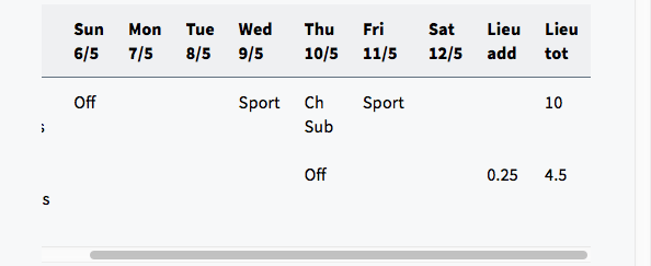
This has the effect of having the table overflow the container horizontally if the content is too wide, like so:

Which is perhaps more readable if pretty ugly. And not what I wanted: to scroll the entire table within its container.
I said attempted earlier because I, er, never deployed the change on the site (it’s been a busy couple of weeks, contrary to the post tempo).
In the meantime, I stumbled across a fix by opening Safari’s reader mode, in which tables scroll horizontally within their container! The secret? The table is wrapped in an enclosing div, which has its overflow-x property set to auto, and then the table scrolls within the div.
Here’s what that looks like when rendered:
Here’s the HTML:
<div class="table-container">
  <table>
  …
  </table>
</div>
And here’s the CSS:
table {
  width: 100%;
}

.table-container {
  overflow-x: auto;
}
You want auto instead of scroll as the latter shows the scrollbar all the time.