Re: Unresponsive
Dr Drang posted recently about his trouble getting his site to work with the new responsive design mode in Safari 9 (which is very similar to the Firefox feature of the same name). He also detailed the complicated setup he has for providing his current mobile layout to small, portrait screens (ie phones) — media queries in HTML link tags and separate stylesheet files.
(I should also point out, if Dr Drang is reading, that his mobile.css file is missing the rule for #content iframe. I’m not sure if this is deliberate.)
Since I’ve fought with responsive design a couple of times, and seemingly have a need to stick my nose into other people’s business, I wondered how difficult it would be to combine the two separate CSS files and get responsive design mode to work.
To give some context to what’s discussed, I’ve put up a gist containing the combined CSS file and required HTML changes. In the CSS file you’ll want to look at the end part, from line 809. That part contains two media queries, which split out:
- Rules only for small portrait screens (ie phones).
- Rules for everyone else (but not small portrait screens).
The two diffs at the top show the changes from Dr Drang’s mobile.css and style.css. The combined file is based on the main stylesheet, which is why there are more changes in the mobile diff.
Most of the changes that make up the Doc’s mobile style sheet are font-size declarations to boost the text size — and these don’t appear in the combined file, which points to the most interesting aspect of this and something that had me confused for not a short while.
Basically, Dr Drang’s mobile style sheet increases the text size to compensate for the mobile browser rendering at “full size” (980px in Safari on iOS). (This is how the New York Times website looked normal in the first iPhone demo in 2007.) The usual technique is to tell the browser to render at “device size” through the use of a meta HTML tag:
<meta name="viewport" content="width=device-width, initial-scale=1">
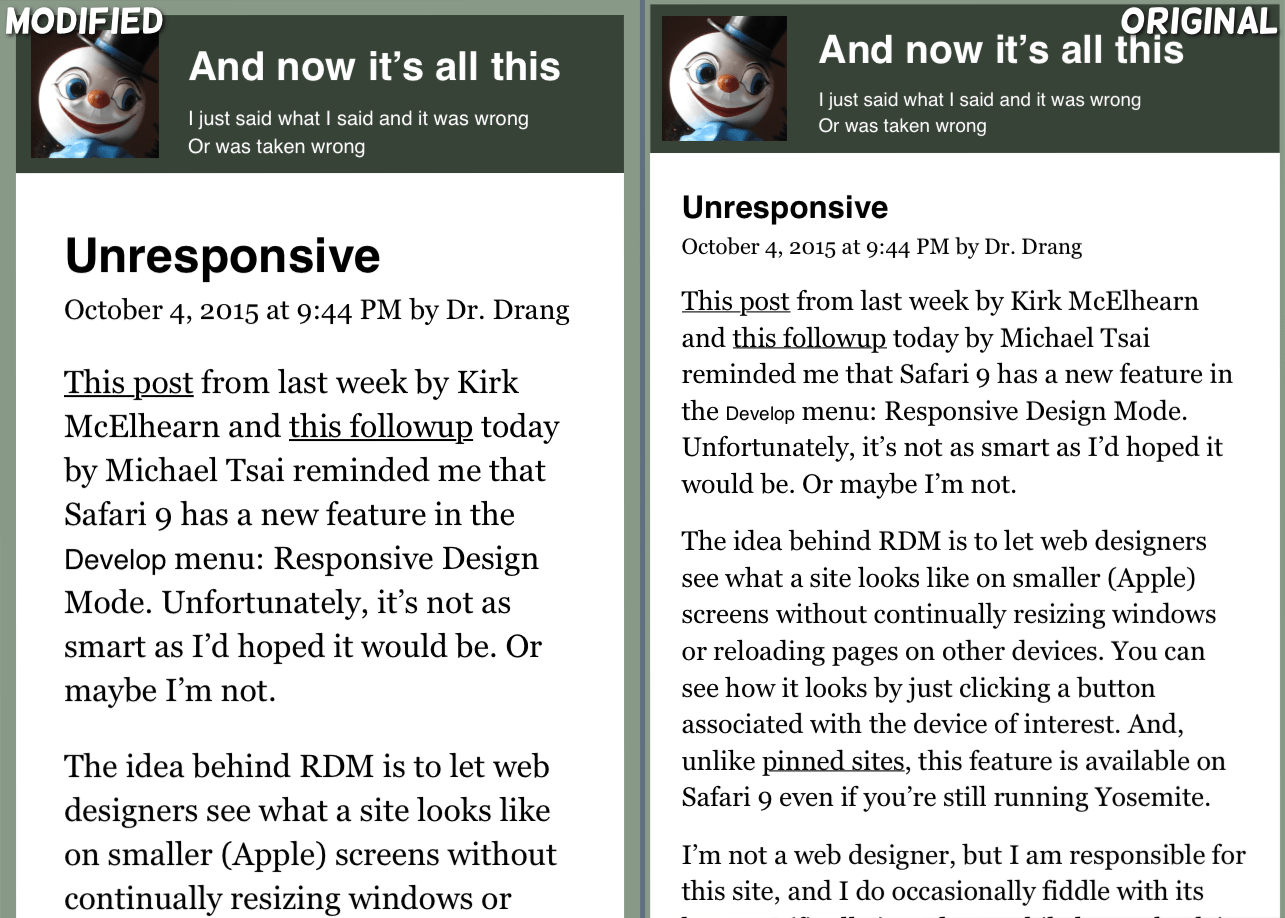
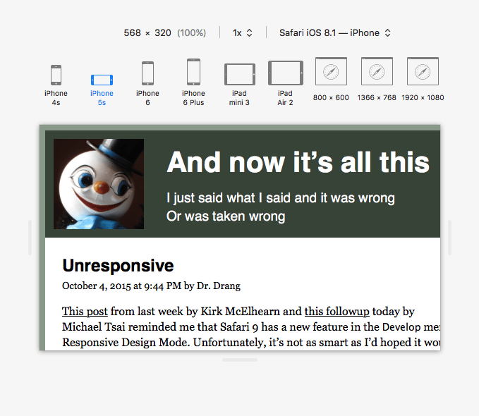
It took me a while to work out that this combined with Dr Drang’s larger text to make everything appear massive:
So those rules went, and some new ones to fix the size of the header came in. But otherwise there are no changes to the styles.
The change in approach means that the result isn’t an exact match for the real site:
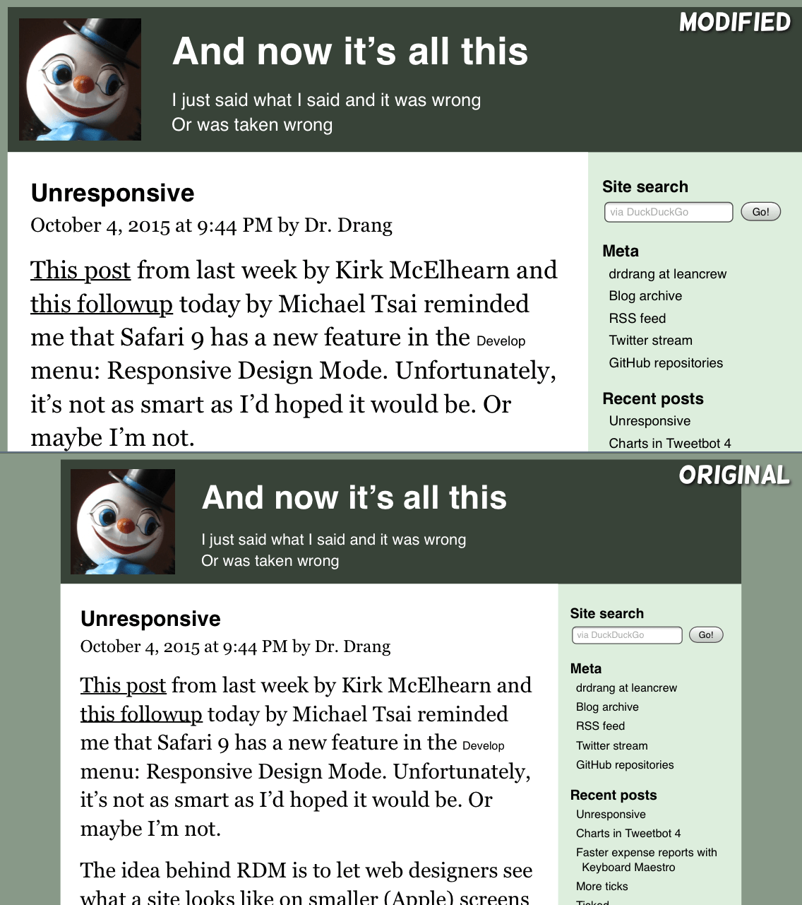
And in landscape the fixed sizes in the CSS file combine with the use of “device size” to produce a layout that’s larger than the screen width, forcing Safari to resize the viewport until it just fits:
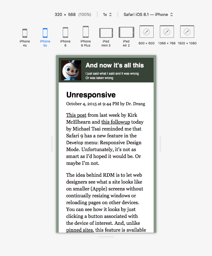
The changes mean that responsive design mode in Safari works for portrait mode:
But landscape mode is not accurate, as there isn’t the viewport-resizing that squeezes the too-large layout to fit on the phone itself:
Lastly, I’m going to close with my tips for not going completely mad when trying to make a responsive layout:
- Have the main part of the CSS file — before any media queries — produce a usable single-column layout (ie for phones).
- Try to have media queries build on previous rules instead of trying to undo them.
- Use as few media queries, and as few rules within them, as possible.
I’ve recently rewritten this site’s CSS to prepare for a behind-the-scenes change. Compared to the current stylesheet, first written in 2013, it’s much saner — specifically with regards to media queries but also in general.
Here’s the current stylesheet and the new one if you want to take a look. In the new file the main part, before any media queries, creates a small layout, which is finessed by a mid-sized media query, then finally adjusted for larger screens.