My one iOS 7 problem
I don’t want to get into the business of critiquing Apple’s OS releases — there are plenty of people better placed to do that. But I have one major criticism of iOS 7. One that irritated me on the day of release and irritates me today. It’s time to share.
I’m Rob and I’m an addict (of changing the screen brightness).
I don’t always second-guess the automatic setting, but I frequently do. Before iOS 7, you had to stop what you were doing, jump to Settings.app, go to the brightness page and adjust the slider. But we’ve now got Control Centre, which you swipe up from the bottom of the screen and it has a brightness slider right there. Sorted?
Not quite. Adjusting the brightness before iOS 7 was slow and a bit haphazard since the settings screen wasn’t always representative of what you were looking at. But you got a decent idea.
Control Centre, however, flat-out lies to you about the brightness:
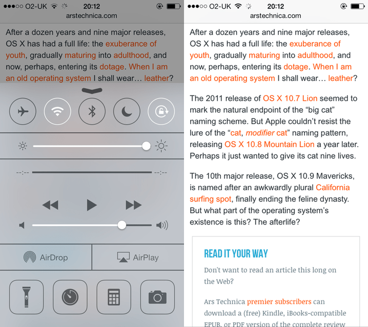
Now, this is by design — Control Centre’s a giant grey panel that covers the screen. But it means that the only elements at the “true” brightness are filled sections of enabled buttons and sliders.
The article in the background of the image above has a white background. If you use an eyedropper, the image on the right scores 100% brightness on a greyscale slider. On the left, with Control Centre shown, it’s just 53%.
Does this background look white to you?
Despite using iOS 7 since its release in September, I still can’t set the brightness to my desired level in a single attempt because of this.
Yes, this is trivial, but let’s try a thought experiment. Imagine the only way you can set the playback volume is through Settings.app or the Control Centre. It’d be way more convenient to use Control Centre, right? How about if it ducked the volume by half?